How to color chart based on cell color in Excel?
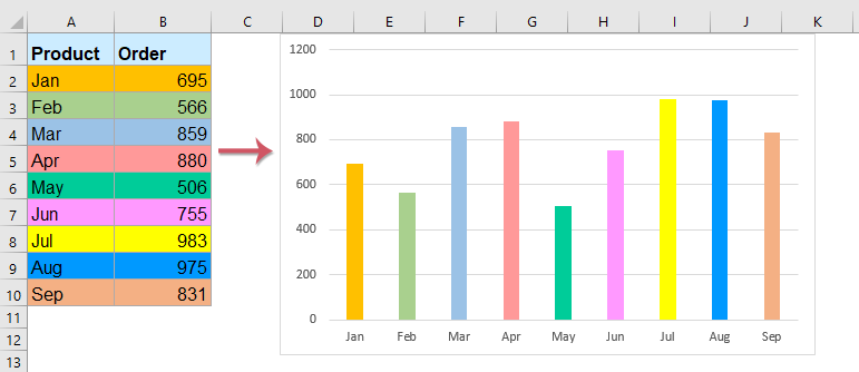
When you create a standard chart in Excel, such as a column or bar chart, the series or data points are assigned Excel’s default colors, which might not correspond to the fill colors in your data range. However, there are many scenarios—such as dashboards, reports, or data visualizations—where you want your chart bars to exactly match the colors you’ve applied to the source cells. This can help maintain visual consistency, make it easier to interpret data at a glance, or reinforce category groupings that use color as a cue for meaning. For example, you may want each column in your chart to reflect the color-coding applied in your summary table, as shown in the screenshot below. Excel does not provide a direct built-in feature to automatically map cell fill colors (especially manual ones) to chart elements, so several different methods are required depending on whether the cell color is manually applied or based on a formula or rule. Below, multiple practical solutions are provided to help you achieve this correspondence effectively in various scenarios.
Color the chart with one or multiple data series based on cell color with VBA codes
Color the chart with one or multiple data series based on cell color with an amazing feature
Color the chart with one or multiple data series based on cell color with VBA codes
Color the chart with one data series based on cell color
If you want your chart bars to inherit the fill color of their corresponding cells and your color assignments are applied manually (not via conditional formatting or formulas), you can use VBA to synchronize chart bar colors with the original cell colors. This technique is especially useful for one-series charts where visual matching is key for clarity or reporting standards.
1. First, select your data and create a bar or column chart. To do this, select your relevant cells and click Insert > Insert Column or Bar Chart. You should see a default chart similar to the screenshot below:

2. Press ALT + F11 to open the Microsoft Visual Basic for Applications (VBA) editor.
3. In the VBA window, click Insert > Module. Then, copy and paste the following code into the module window. This script will update each chart bar to match its corresponding cell's fill color.
VBA code: Color chart bars with one data series based on cell color:
Sub ColorChartColumnsbyCellColor()
'Updateby Extendoffice
    Dim xChart As Chart
    Dim I As Long, xRows As Long
    Dim xRg As Range, xCell As Range
    On Error Resume Next
    Set xChart = ActiveSheet.ChartObjects("Chart 1").Chart
    If xChart Is Nothing Then Exit Sub
    With xChart.SeriesCollection(1)
        Set xRg = ActiveSheet.Range(Split(Split(.Formula, ",")(1), "!")(1))
        xRows = xRg.Rows.Count
        Set xRg = xRg(1)
        For I = 1 To xRows
            .Points(I).Format.Fill.ForeColor.RGB = ThisWorkbook.Colors(xRg.Offset(I - 1, 0).Interior.ColorIndex)
        Next
    End With
End Sub
4. After entering the code, press F5 to run the macro. The chart bars should now reflect the fill colors of the source cells, offering immediate visual correspondence, as shown in the following screenshot:

This method is advantageous for charts where cell fill colors are set by hand and frequent manual adjustments are expected. Keep in mind, however, that if the cell colors change, you need to rerun the VBA to update the chart, since the linkage isn’t dynamic. Also, remember to save your workbook as a macro-enabled file (.xlsm) so the code persists.
Color the chart with multiple data series based on cell color
If your chart contains multiple data series (for example, several products across time or different categories), you can use a similar VBA approach to map each bar segment or data point to its source cell’s fill color. This can help keep your reports visually aligned and makes it easy for viewers to cross-reference data between the worksheet and the chart.
1. Set up your data and create a multi-series bar or column chart as shown below:

2. Press ALT + F11 to open the VBA editor.
3. In the VBA window, click Insert > Module and paste in the following code:
VBA code: Color chart bars with multiple data series based on cell color:
Sub CellColorsToChart()
'Updateby Extendoffice
    Dim xChart As Chart
    Dim I As Long, J As Long
    Dim xRowsOrCols As Long, xSCount As Long
    Dim xRg As Range, xCell As Range
    On Error Resume Next
    Set xChart = ActiveSheet.ChartObjects("Chart 1").Chart
    If xChart Is Nothing Then Exit Sub
    xSCount = xChart.SeriesCollection.Count
    For I = 1 To xSCount
        J = 1
        With xChart.SeriesCollection(I)
            Set xRg = ActiveSheet.Range(Split(Split(.Formula, ",")(2), "!")(1))
            If xSCount > 4 Then
                xRowsOrCols = xRg.Columns.Count
            Else
                xRowsOrCols = xRg.Rows.Count
            End If
            For Each xCell In xRg
                .Points(J).Format.Fill.ForeColor.RGB = ThisWorkbook.Colors(xCell.Interior.ColorIndex)
                .Points(J).Format.Line.ForeColor.RGB = ThisWorkbook.Colors(xCell.Interior.ColorIndex)
                J = J + 1
            Next
        End With
    Next
End Sub
4. Run this code by pressing F5. Your chart’s series will be updated to reflect the cell fill colors in your data range, as illustrated below:

- The code refers to the chart as Chart1 by default. Please adjust it to match your chart’s actual name as needed.
- This approach also supports line charts, not just bar or column types.
- If you encounter any issues (such as no update or errors), check that your chart’s data series and the cell color range are aligned one-to-one.
Although this technique gives you full control and flexibility for manually colored data, it doesn’t handle cases where color is generated via conditional formatting or automatically by formulas. In those situations, see the formula-based and conditional formatting solutions below for more dynamic options.
Color the chart with one or multiple data series based on cell color with an amazing feature
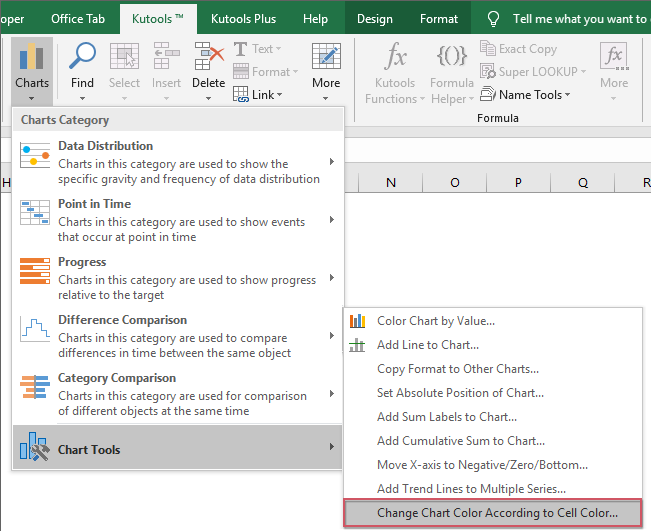
While VBA can synchronize chart colors with cell fills, it requires running code manually and some users may not be comfortable with macros or VBA security prompts. If you are looking for a more streamlined and interactive approach, the Change Chart Color According to Cell Color feature in Kutools for Excel offers an efficient solution. This tool automatically applies cell fill colors to the corresponding chart elements, whether you have one or multiple data series in your chart, and works even if you update the cell colors later (a simple re-apply will refresh the mapping).
After installing Kutools for Excel, proceed as follows:
1. Insert the chart you wish to color. Select the chart, then navigate to Kutools > Charts > Chart Tools > Change Chart Color According to Cell Color, as shown in the image below:
2. When prompted, simply click OK in the dialog box that appears.
3. The chart will immediately update to match your cell colors, as shown in the following examples:
Color the chart with one data series based on cell color

Color the chart with multiple data series based on cell color

This feature is ideal for anyone who regularly needs to match chart colors automatically and wants a reusable solution regardless of data updates. It saves significant time compared to manual formatting or running macros, and is particularly helpful in collaborative environments where multiple people edit data or chart presentations.
Download and free trial Kutools for Excel Now !
More relative chart articles:
- Create A Bar Chart Overlaying Another Bar Chart In Excel
- When we create a clustered bar or column chart with two data series, the two data series bars will be shown side by side. But, sometimes, we need to use the overlay or overlapped bar chart to compare the two data series more clearly. In this article, I will talk about how to create an overlapped bar chart in Excel.
- Copy One Chart Format To Others In Excel
- Supposing there are multiple different types of charts in your worksheet, you have formatted one chart to your need, and now you want to apply this chart formatting to other charts. Of course, you can format others manually one by one, but this will waste much time, are there any quick or handy ways for you to copy one chart format to others in Excel?
- Highlight Max And Min Data Points In A Chart
- If you have a column chart which you want to highlight the highest or smallest data points with different colors to outstand them as following screenshot shown. How could you identify the highest and smallest values and then highlight the data points in the chart quickly?
- Create A Step Chart In Excel
- A step chart is used to show the changes happened at irregular intervals, it is an extended version of a line chart. But, there is no direct way to create it in Excel. This article, I will talk about how to create a step chart step by step in Excel worksheet.
- Create Progress Bar Chart In Excel
- In Excel, progress bar chart can help you to monitor progress towards a target as following screenshot shown. But, how could you create a progress bar chart in Excel worksheet?
Best Office Productivity Tools
Supercharge Your Excel Skills with Kutools for Excel, and Experience Efficiency Like Never Before. Kutools for Excel Offers Over 300 Advanced Features to Boost Productivity and Save Time. Click Here to Get The Feature You Need The Most...
Office Tab Brings Tabbed interface to Office, and Make Your Work Much Easier
- Enable tabbed editing and reading in Word, Excel, PowerPoint, Publisher, Access, Visio and Project.
- Open and create multiple documents in new tabs of the same window, rather than in new windows.
- Increases your productivity by 50%, and reduces hundreds of mouse clicks for you every day!
All Kutools add-ins. One installer
Kutools for Office suite bundles add-ins for Excel, Word, Outlook & PowerPoint plus Office Tab Pro, which is ideal for teams working across Office apps.
- All-in-one suite — Excel, Word, Outlook & PowerPoint add-ins + Office Tab Pro
- One installer, one license — set up in minutes (MSI-ready)
- Works better together — streamlined productivity across Office apps
- 30-day full-featured trial — no registration, no credit card
- Best value — save vs buying individual add-in