How to create a win loss sparkline chart in Excel?
In Excel, a win loss chart displays positive and negative values with different colors which can help you to view the trends of multiple data. This article, I will talk about how to create a simple win loss sparkline chart in cells.
Create a win loss sparkline chart in Excel
Create a win loss sparkline chart in Excel
The following steps may help you to create the win loss chart, please do as this:
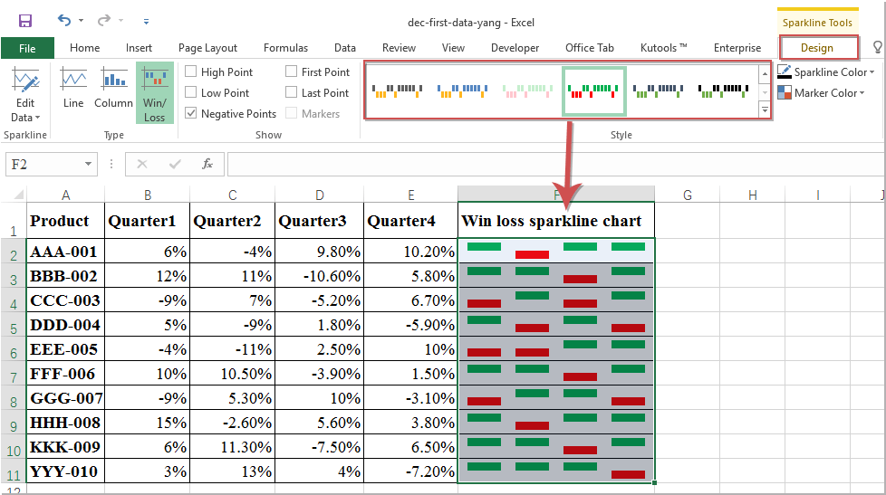
1. Click Insert > Win/Loss, see screenshot:

2. And a Create Sparklines dialog box is popped out, select the data range that you want to create charts based on, and then choose the cells where you want to output the charts, see screenshot:

3. Then click OK button, and you will get the charts as following screenshot shown:

4. At last, you can change the charts style to your need in the Style list box, see screenshot:
Best Office Productivity Tools
Supercharge Your Excel Skills with Kutools for Excel, and Experience Efficiency Like Never Before. Kutools for Excel Offers Over 300 Advanced Features to Boost Productivity and Save Time. Click Here to Get The Feature You Need The Most...
Office Tab Brings Tabbed interface to Office, and Make Your Work Much Easier
- Enable tabbed editing and reading in Word, Excel, PowerPoint, Publisher, Access, Visio and Project.
- Open and create multiple documents in new tabs of the same window, rather than in new windows.
- Increases your productivity by 50%, and reduces hundreds of mouse clicks for you every day!
All Kutools add-ins. One installer
Kutools for Office suite bundles add-ins for Excel, Word, Outlook & PowerPoint plus Office Tab Pro, which is ideal for teams working across Office apps.
- All-in-one suite — Excel, Word, Outlook & PowerPoint add-ins + Office Tab Pro
- One installer, one license — set up in minutes (MSI-ready)
- Works better together — streamlined productivity across Office apps
- 30-day full-featured trial — no registration, no credit card
- Best value — save vs buying individual add-in